APPETITE - LET US CHOOSE YOUR NEXT MEAL, WE’LL DO THE BRAINWORK
HOW DO WE ANSWER THE OLD QUESTION….WHAT DO I FEEL LIKE EATING?
PROBLEM
The problem we had to answer is one that everyone deals with, what do I feel like eating? It takes a relatively small amount of brainpower to make a food decision but having the ability to streamline the process would be helpful. To get rid of a remedial daily task allows more brainpower for other important matters.
SOLUTION
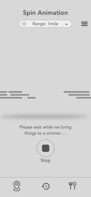
To tackle the problem we made a type of roulette prize wheel. Food selection is totally random and is also gathered from restaurants in your immediate vicinity. Gamifying the system makes the semi-stressful process now free and something to really look forward to.
Scope: 1.5 years
Categories: UX Research, UI/UX Design, Illustration, Animation
Role: Passion project with a engineer buddy. Responsible for UI/UX Design, produced all design and motion.
Tools: Draw iO, Sketch, Photoshop, Illustrator, After Effects
Currently in development*
GET IN THE MOOD TO CHOW DOWN
Aside from choosing your next meal we wanted to get our users tastebuds going. In only felt right to make our icons the main focus of the app. We want you to be excited about the coming meal and our design assist us in that effort.
A fully saturated vibrant render was applied to the icon artwork. These illustrations pop off the page, while contrasting the text and buttons on the page. We rely on the use of gamification and our ‘roulette prize wheel spin’ to add a feeling of reward. When clean typography, bold iconography and a fun mechanic combine it creates a unique experience for our user.
A SATISFYING FEELING
Our ‘roulette prize wheel’ spin mechanic randomly selects a food type from surrounding restaurants in your immediate area. Upon selection we also recommend one of those same restaurants. A celebratory animation with some added effects around the icon are presented to our user. The use of the large turquoise background sets the hierarchy of positive actions throughout the application as well as contrast the icon styles.
WHAT’S AROUND HERE?
To help assist our user in finding which food options are in there immediate area we offer a map view. The map shows all food locations and their distances relative to your current location. Adjusting the range on the map can widen or shrink the radius to include as much, or as little as you want.
MORE OPTIONS ARE AVAILABLE!
More times than not there are multiple places with the same type of food, so how do we decide then? To solve this issue we have a swipe up menu that displays the multiple options for any one type of food. Restaurants are shown in a list view and compare distance as well as price range.
From this menu you can drill down further to find details on a particular place. In later versions we hope to add an order feature just in case our users do not feel like traveling.
ICON ILLUSTRATIONS
Icons are the main focal point of this app so we spent a lot of time on the artwork. All of the icons were created in Illustrator and follow a specific style. We aimed to make the icons feel tangible and ‘gummy’, this would help draw in our users. In tandem we created our icons to be bright and vibrant while at the same time heavily leaning on the red, orange, and yellow color gamut. Psychologically speaking, these colors are most known to stimulate hunger in people. Piggybacking off of the color usage, we singled out a specific visual we thought was most palatable to our users.
ICON CREATION + ANIMATION
All of our icons started with an initial sketch based on our mood board reference. Sketches were then cleaned up as a wireframe, then we blocked in color. When the desired color tone was achieved highlights and shadows were added. Icons were then broken up into separate layers for animating. Each icon has its own unique loop that triggers upon selection.
THE PROCESS
To view the entire flow tap the button to download the full PDF
THE PROBLEM IN DETAIL
If you've ever found yourself staring at a lengthy restaurant menu and been completely unable to decide what to order for lunch, you have experienced what psychologists call choice overload. The brain, faced with an overwhelming number of similar options, struggles to make a decision. - ScienceDaily
Although this is may not be the only reason, economics can also explain why face such difficulties. Cost plays a role when looking for food, in tandem we are also looking to maximize value or get more “bang for you buck”. Saturation points can effect us in another way by boring our tastebuds, there is only so much food you can keep eating before you get sick of it. I believe that if we were able to reallocate brain power with a tool that streamlines this process we would be more open to suggestion and get to food faster.
WIREFRAMES + FLOW
Here are a few high fidelity wireframes that were used to establish the UI layout and assist in a very early user test via the InVision app. To view the entire flow click the button below.
MOOD BOARD AND EXPLORATION
Because we are dealing with food the overall design needed to be ‘alive’ and eye grabbing almost as if the food was jumping off of the screen. This was the 3rd and final round of mood boards chosen, after reviewing existing food apps and icons we decided that a dimensional material design was needed.


